Whenever I go to look at art, I play a game… which piece would I take home? It has nothing to do with whether or not I can afford the art, it’s an acknowledgement of how much I’m moved by what I see. I found a few candidates at QuiltCon, so I’ll share them with you here. If you want to see more quilts, look at the #quiltcon and #quiltcon2016 hashtags on Instagram.
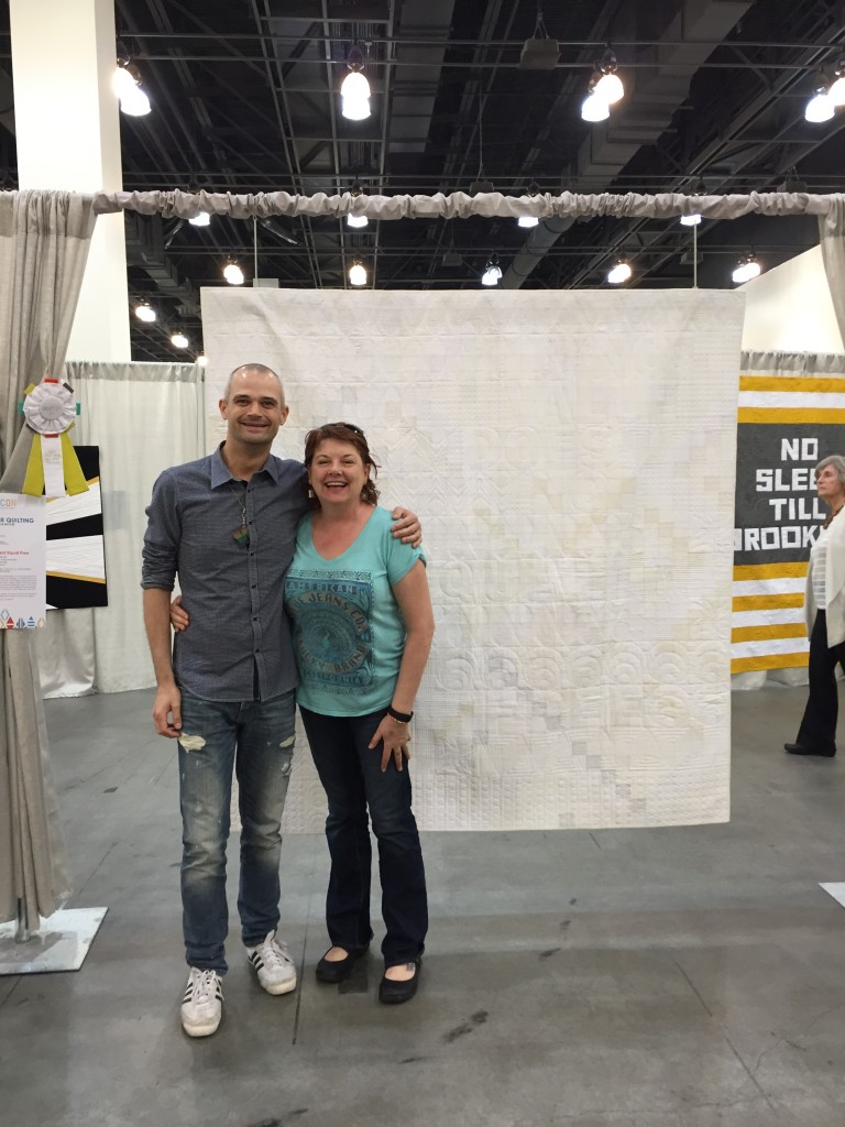
No Value Does Not Equal Free by Molli Sparkles (quilted by Jane Davidson)
It was SO GREAT to meet this guy! And really great to meet someone you’ve only “internet” known, and to find out that you really DO like them – he’s a classy guy! This quilt was the one he made in response to my WASWI campaign, and my friend Jane Davidson did the long arm honors. I was so thrilled to take a picture of us together that I missed getting details of the quilt, but you can see those on Molli’s blog.
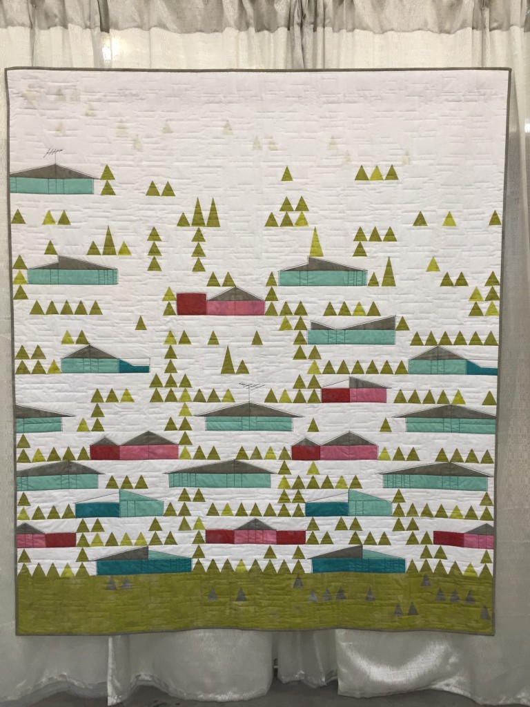
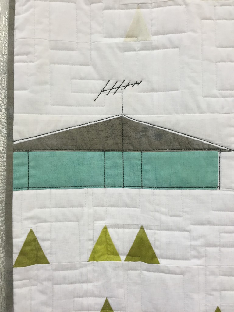
Eichler Homes – Mickey Beebe (quilted by Tami Levin)
The magic in this quilt is all in the details… check out the echoed outlines on the houses, complete with little details like TV antennas. A perfect homage to the illustrations of the era, and probably my top pick of the show.
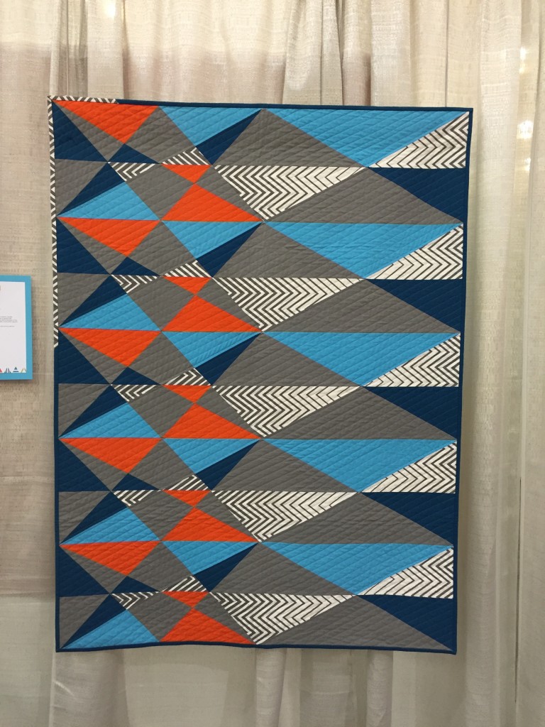
ZAG by Kari Anderson
The confident and careful use of color and pattern texture on this quilt is wonderful, and all that ORANGE made me happy!
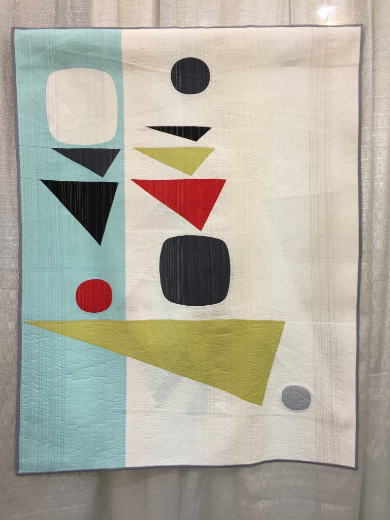
Balancing Act by Stephanie Ruyle
I adore the mid-century vibe and coloring of this piece.
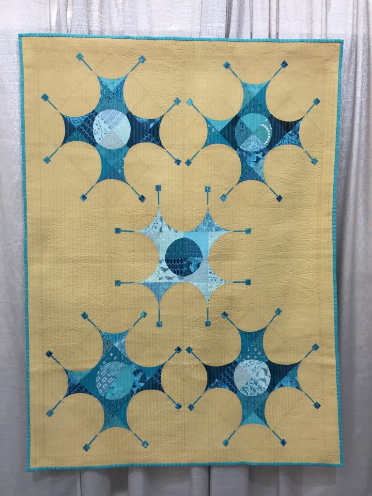
Bursting Blues by AnnMarie Cowley
AnnMarie is a member of my guild, and frankly, she is an artist to watch. She does some really innovative work, with impeccable craftsmanship. It was a thrill to see her work included.
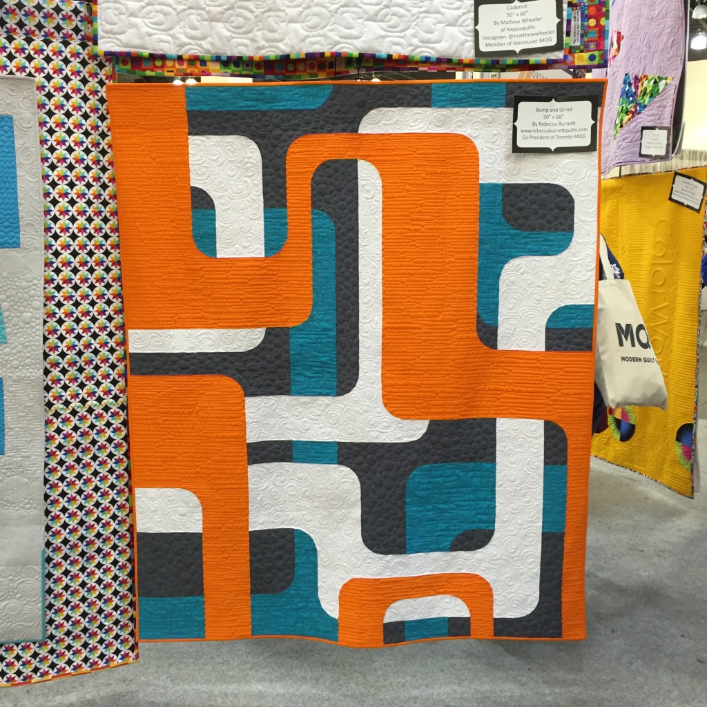
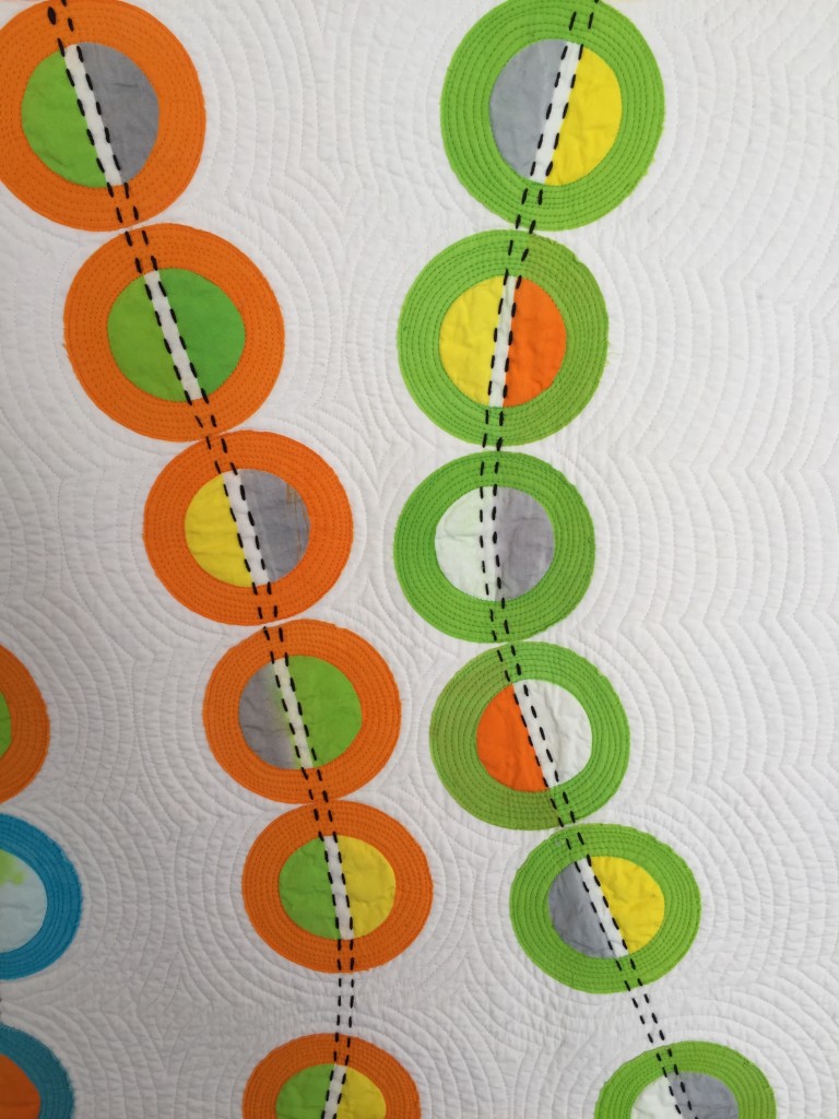
Bump and Grind by Rebecca Burnett
This was hanging in the Northcott Booth, and stopped me in my tracks with all its ORANGE and teal goodness.
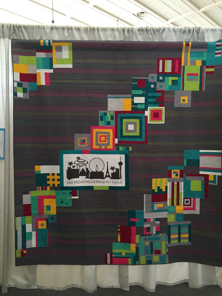
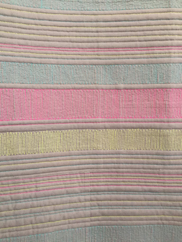
The Modern Strip Quilt by Vicki Ruebel and members of the Las Vegas MQG
This quilt is notable for the use of colored thread in the quilting to affect a change in the fabric color. Very cleverly done (although I thought the technique might render it a bit stiff for cuddling).
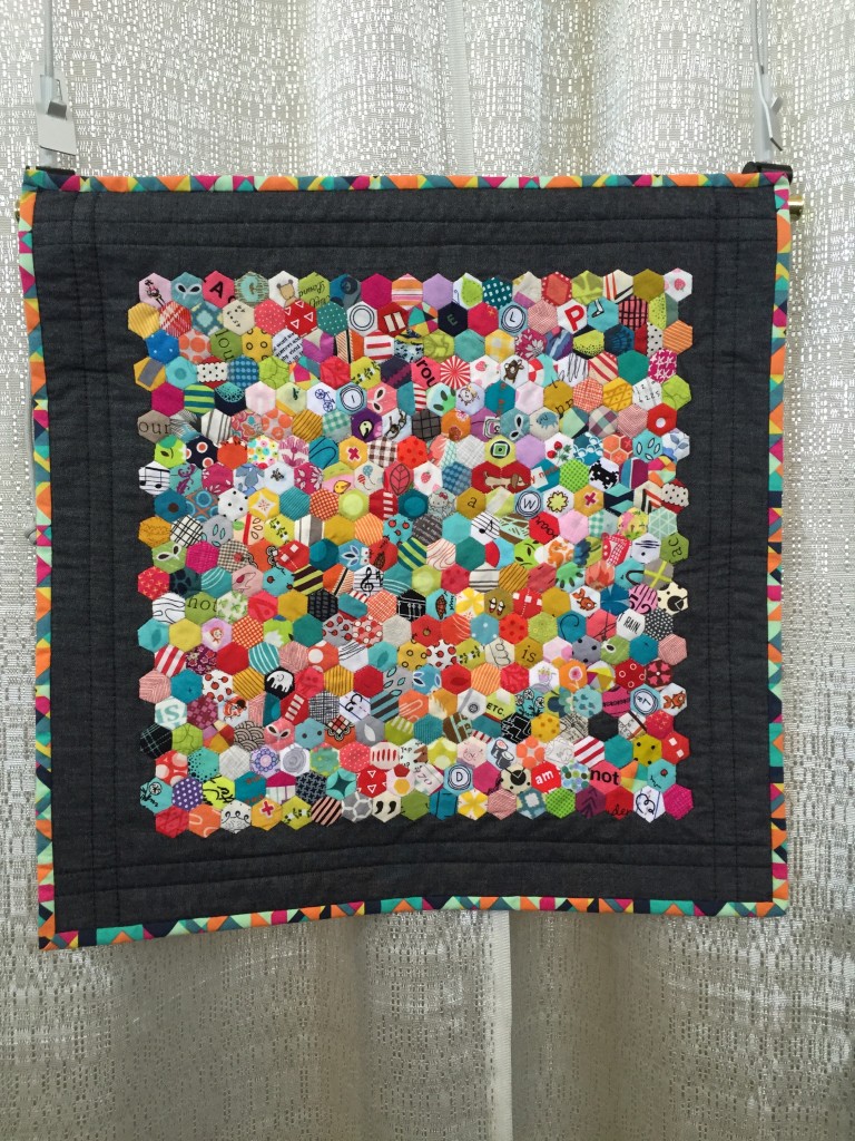
Itsy Bitsy Hexie Quilt by Sofia Locke
This was in the Youth category – great use of fussy-cut fabrics, and lovely craftsmanship. We should keep an eye on this young lady!
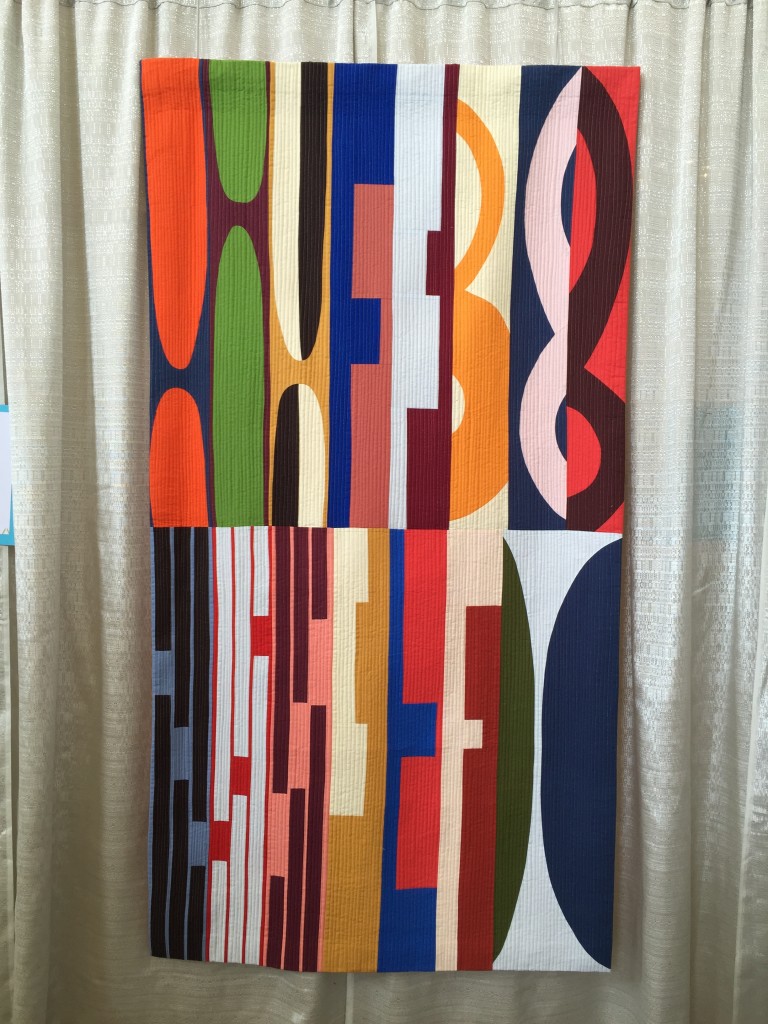
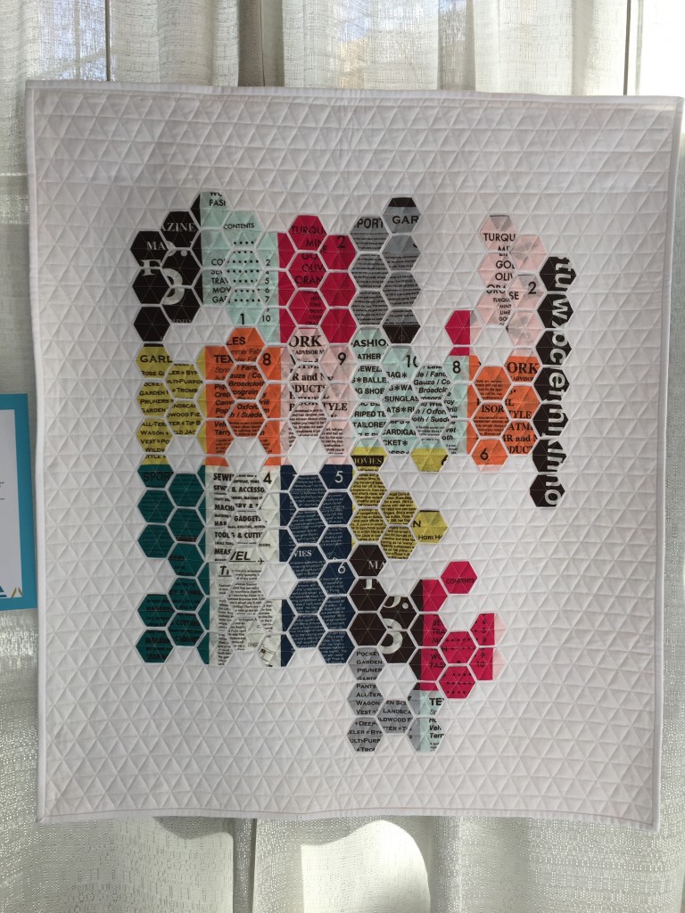
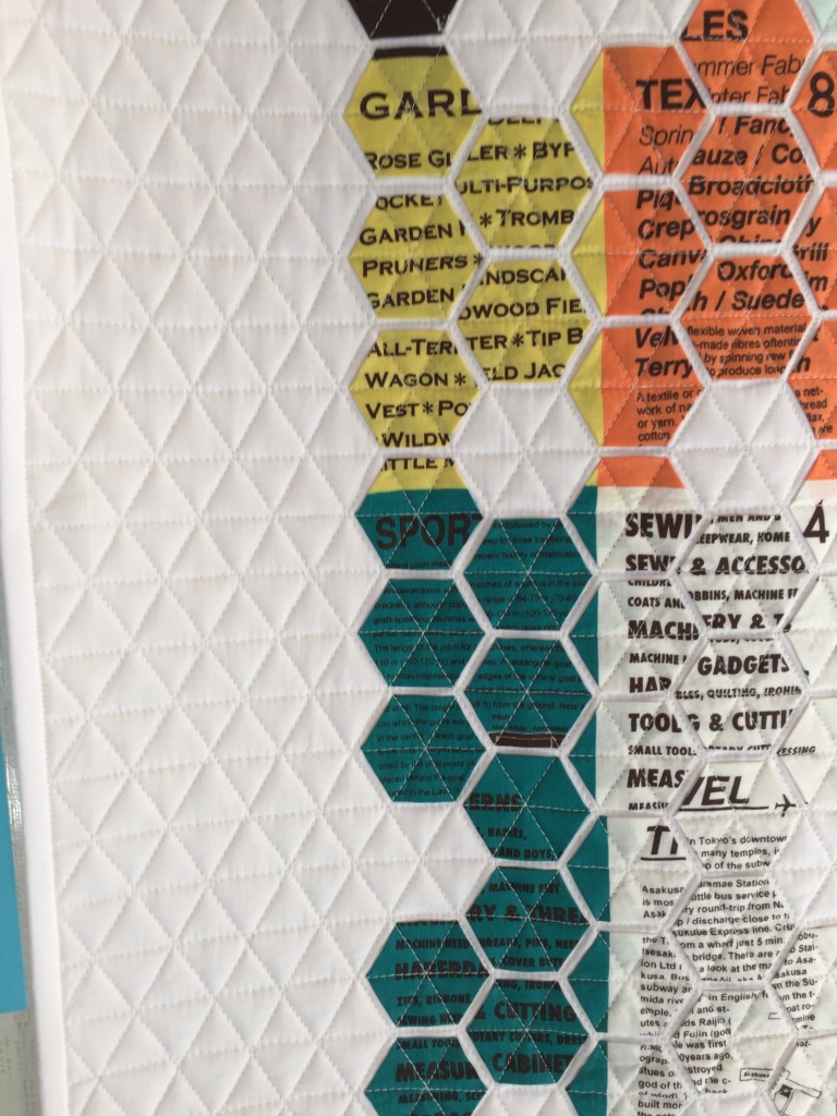
Graphics 1 by Kerri Green
I’m a text junkie. I love how the text was used, and it reminds me of great letterpress work.
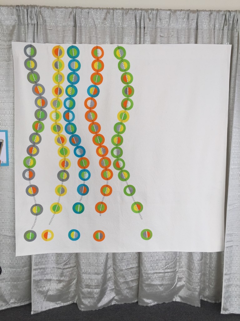
Falling by Kathy York
This one just made me smile. Sometimes that’s the most important thing 🙂 Lovely accent quilting done by hand, too.
Geometric Text by Nicole Daksiewicz
Another fine exploration of text, and I appreciate the skill in keeping the words aligned throughout the pieces.
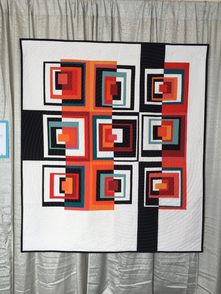
The Color of Squares by Juli Smith
How could I not love all that ORANGE? Great graphic qualities too.


My impression from the photos I’ve seen is that the quality of design AND construction really stepped up this year. So great to see. Thanks for sharing your photos and of course crediting the quilters! 🙂
These are absolutely stunning pieces!! I can’t even pick a favorite among these . . . they are all top notch.
I’m glad you liked my quilt! Thanks for taking and sharing your photos.
Mickey – I would steal it if I could!
I’m very pleased to discover this great site. I need to
to thank you for your time just for this wonderful read!!
I definitely enjoyed every bit of it and i also have you bookmarked to
see new things on your website.
Hypnotic Post – Cards work with the right combination of keywords I received
from the internet Wealth – Affiliate keyword tool in the members area.
SEO is an abbreviation for ‘search engine optimization’. The best way to meet your potential
customers’ needs is to give them a way to interact directly with you.
How can you apply SEO to your graphics-intensive website.
For example, a sub-page of this hypothetical site might be.
Think about ways people might search for your website, and be sure to incorporate those keywords and
phrases into your site that will help them find you.