
Colorblock LOVE doesn’t have a complicated color story, but like most quilts, it will sing brighter when you get your fabric choices tuned in. So here are some tips for choosing your fabrics. This post has a LOT of information, so grab a cuppa and enjoy!
This post is also part of the Colorblock Love QAL!
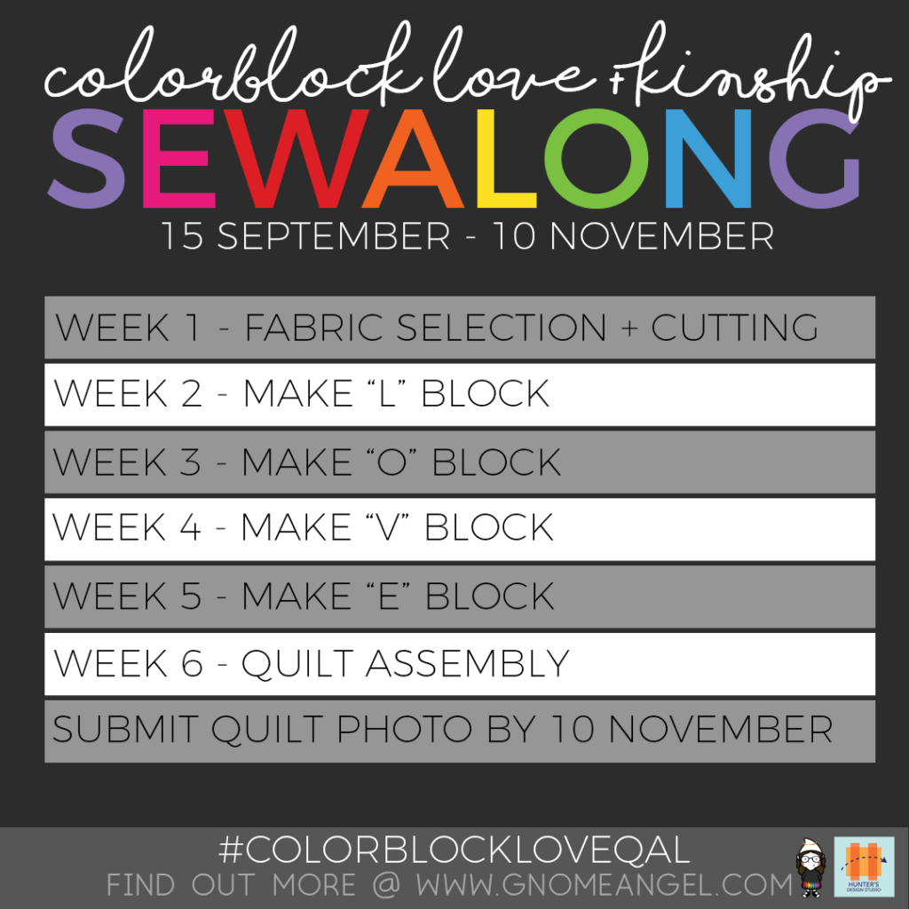
If you’re following the QAL, Week 1 is TWO posts… this one on how to choose your fabrics, and this one on How to Make Long Cuts are what you need to cut out the parts for your blocks!
The quilt is written for just 6 fabrics, but of course, you can make it more complex if you like. REMEMBER: this is YOUR quilt, so you get to make it YOUR way!
Your Colorblock LOVE pattern includes a link to the downloaded Addendum which gives you the fabric quantity info for making each section of this quilt from a different fabric – 21 fabrics total! The Addendum also has info for going rainbow style in solids from different fabric manufacturers, a foundation paper-pieced mini LOVE quilt, and info for merging the Kinship: Fusion 100 Block Sampler into the LOVE letters! Be sure to download it!
Color story ideas for Kinship + Love are all the way at the bottom of this post, so read on!
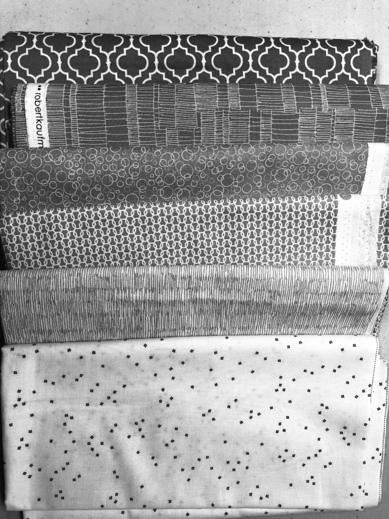
Regardless of how many fabrics you use (6 or 21, or anywhere in between) the quilt is going to look its best when you pay attention to VALUE. VALUE is how dark or light a fabric reads, regardless of its color. This is where being able to see your selections in grayscale will help immensely. If you don’t know how to snap a picture on your mobile phone and make it go monochrome, hop onto the interwebs and look up how to do it for your mobile device. You’re welcome! And if you don’t have a mobile phone that takes pictures, I recommend owning a Ruby Ruler – a nifty notion that allows you to see fabric values by merely looking through it. I’ll show you this later on in the post, but first, a quick discussion on how this quilt works best in color.
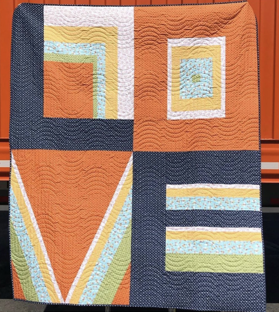
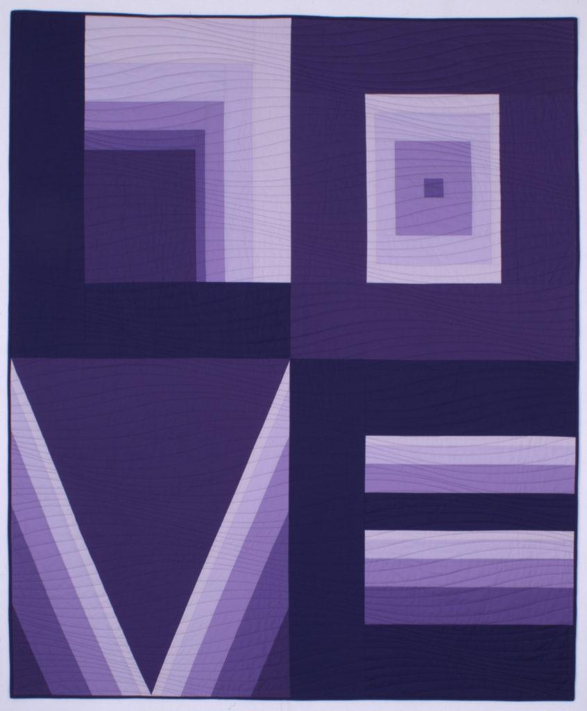
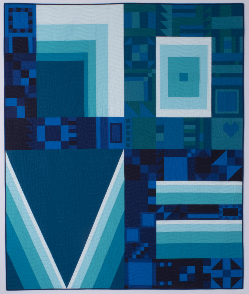
Let’s look at the pattern’s cover quilt:
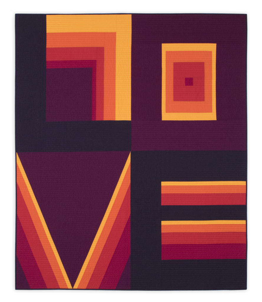
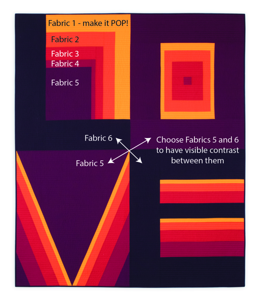
In this quilt, I used a warm family of Kona Solids, ranging from a very dark purple through red and orange to yellow. In the pattern, the lightest is Fabric 1, and the darkest is Fabric 6. There are TWO major places to pay attention to:
- Fabric 1, the lightest, should pop when placed next to Fabrics 5 and 6. Look at the yellow (Fabric 1) in each letter, and see how it shines next to the darks of 5 and 6, and specifically how it highlights the center of the V
- Fabric 5 and 6 need to be apart enough in value that you can see the difference in them easily. Yes, they can be the same color family, but the difference between the super dark of the outer L and E (Fabric 6) and the medium dark of the outer O and the body of the V (Fabric 5) are what make the letter blocks distinct from each other.
Another way to get the letter blocks to be distinctly different is to choose VERY different fabrics for fabrics 5 and 6.
In this version, made from Ruby Star Society’s Darlings, Fabric 5 is dark pink and Fabric 6 is black. Note that Fabric 1 is not the lightest pink, but it has solid reading texture (instead of the horses in the lightest pink) and the pink is a bit HOT so it pops against Fabrics 5 and 6:
![]()
In this version, made from Maywood Studios’ Carnaby Street, Fabric 5 is orange, and Fabric 6 is navy. Note that Fabric 1 is the lightest in the group, and again, has a solid reading texture to hold the line sharp, especially next to Fabric 5 in the V:
In this version, made from Hoffman Fabrics’ Sparkle and Fade, Fabric 5 is black and Fabric 6 is red. The rest of the fabrics follow a classic gradation from darker gray to lightest gray/white, with Fabric 1 being the lightest:
And in this version, a digital rendition of Art Gallery Pure Elements solids, each letter uses a different color family. This makes keeping the contrast between the letters a little easier. Note that in each letter Fabric 1 still pops nicely – and in the O the values are reversed to make it work. O is usually dark on the edge, but dark yellow didn’t play well in the rainbow vibe so inverting the values worked well:

So as you can see, there are LOTS of ways to do this!
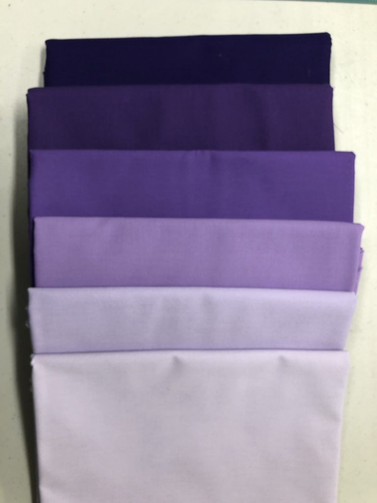
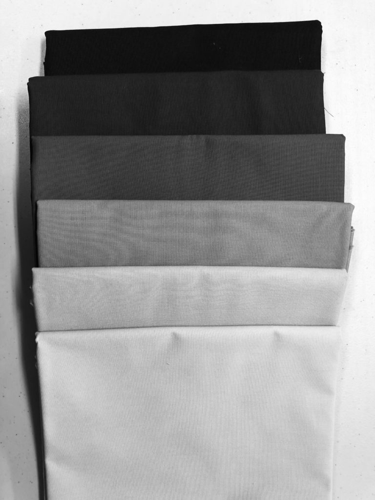
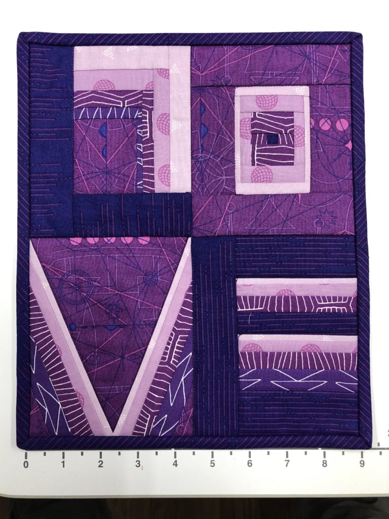
The simplest is to choose a color, and just do a value gradation from light to dark. Here’s a version of a simple gradation in purple, and next to it, the same photo in grayscale. There’s good contrast from light to dark, and you can see the difference between Fabrics 5 and 6 (the top two in the stack):
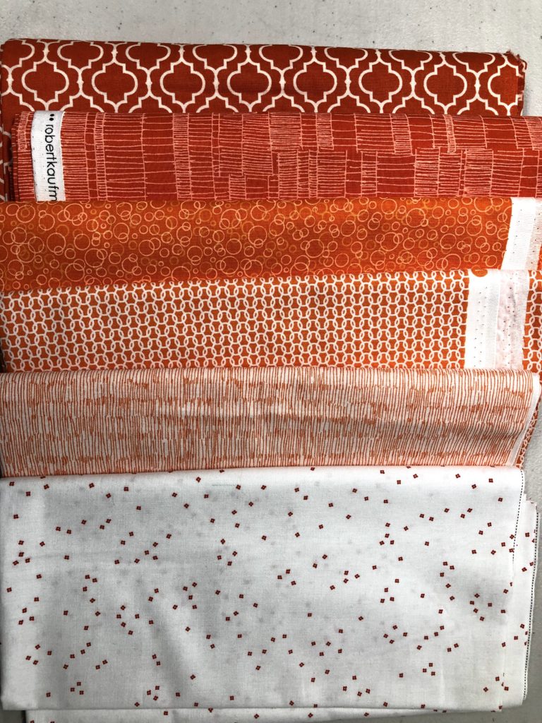
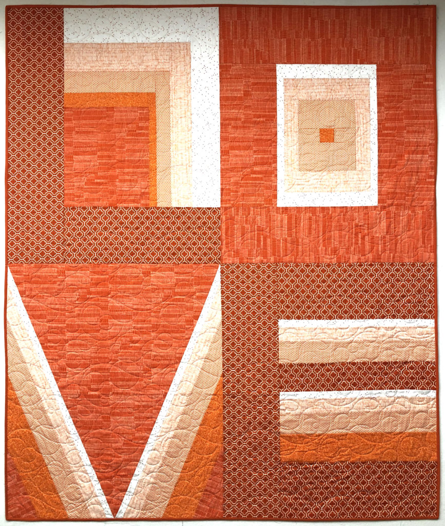
And in this stack the contrast could perhaps be a bit stronger (orange doesn’t lend itself to extremes of dark and light without heading into rust and peach – neither of which I wanted!) but the pattern texture is going to do the work of keeping Fabrics 5 and 6 apart:
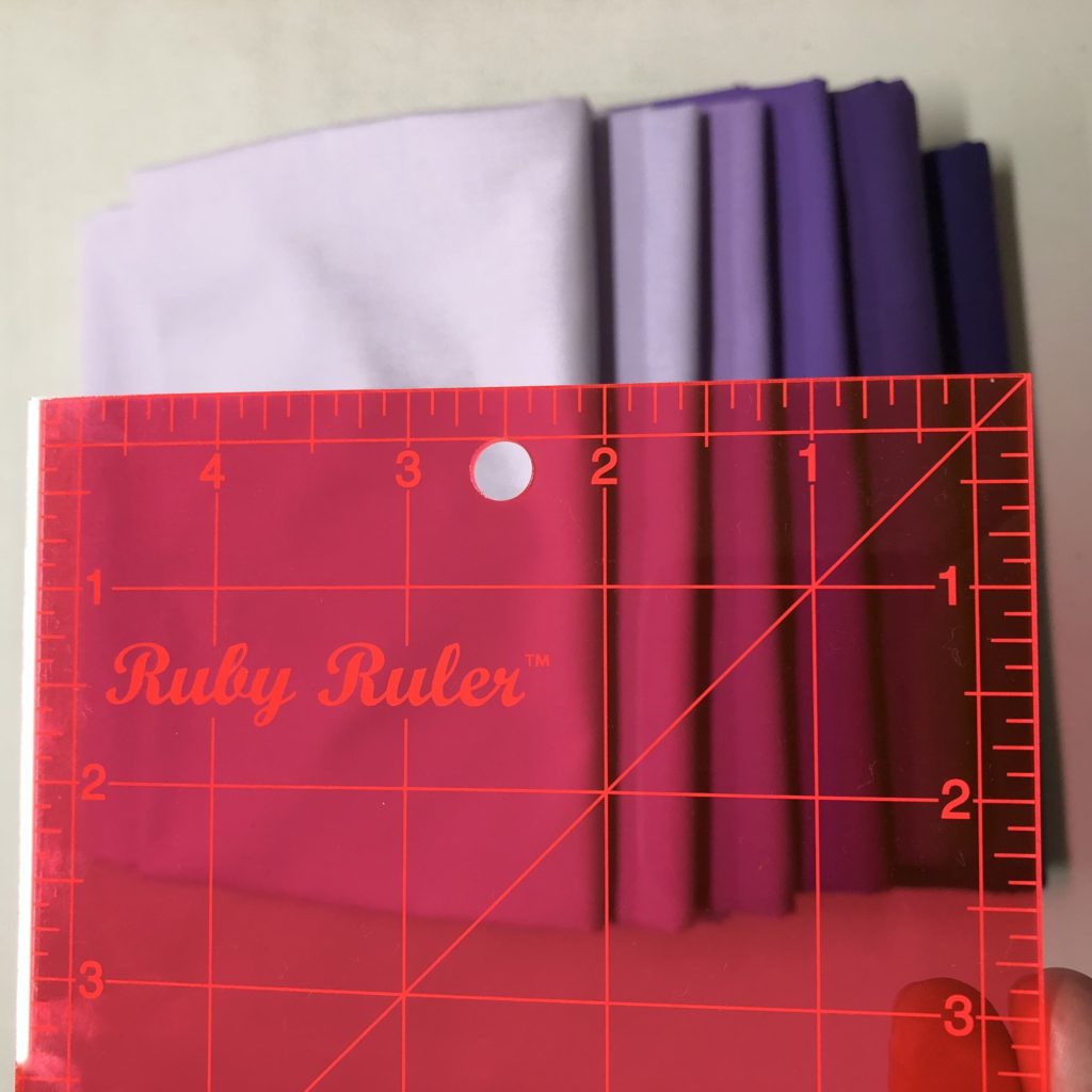
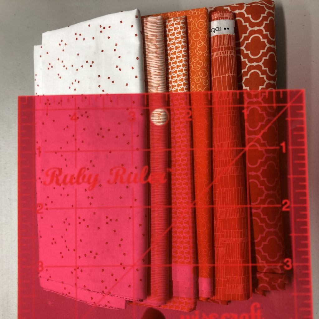
If you don’t have an easy way to take a picture and turn it grayscale, I recommend using a Ruby Ruler, by Wise Craft Handmade:
You hold it over your fabrics and just look through it. The red filter takes out the color but leaves the value visible:
And a final idea for evaluating your fabrics… make a mini. The pattern addendum file includes a foundation paper pieced pattern to make a miniature quilt of just 9” x 11”. If you’re concerned that you might have a tricky fabric in your group, make the mini first to see how it behaves before committing to the big quilt! Note that the pattern scale of some fabrics might not translate well, but the colors and their values will give you good information.
In this version, I wasn’t sure I liked Fabric 4 (dark blue-violet with white triangles) but once I made the mini, I was confident that fabric was OK:
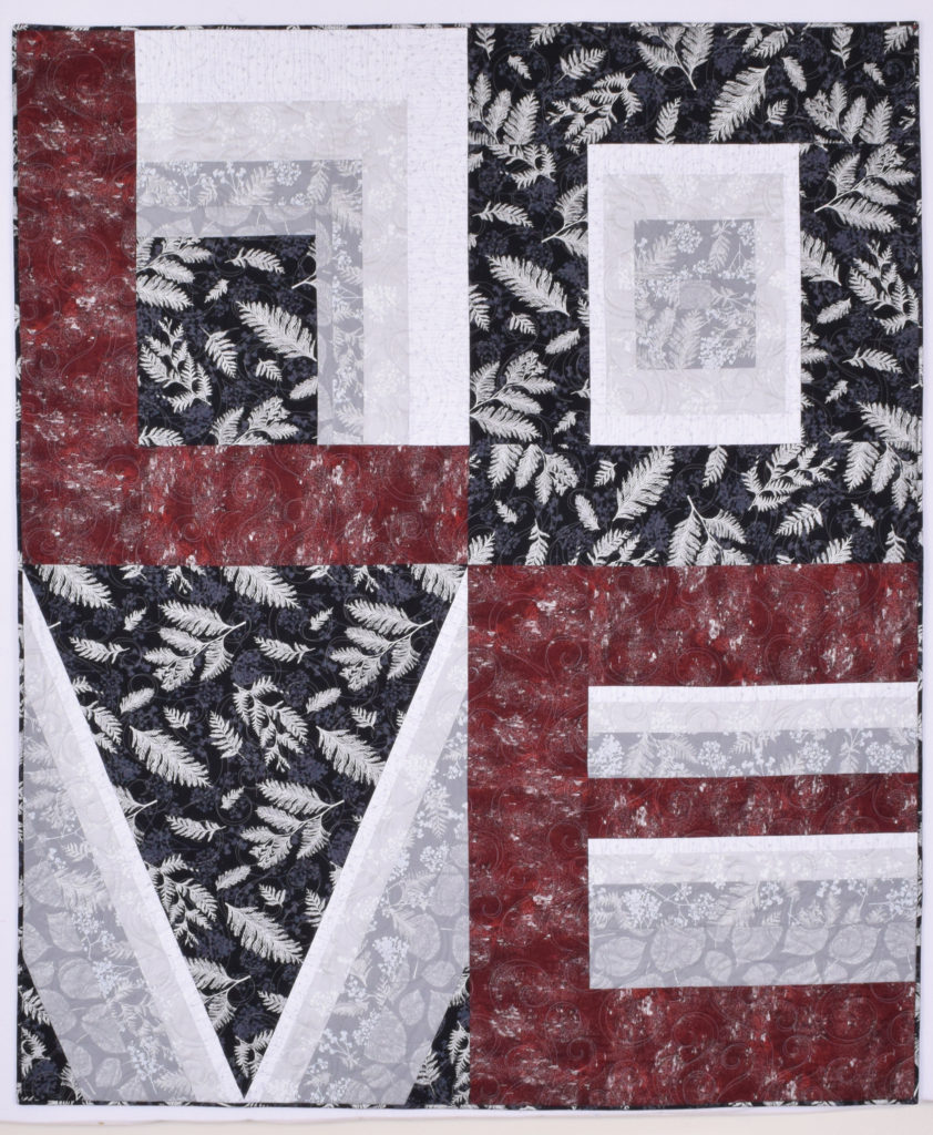
The last version I have to show you is one I made using Kinship: Fusion 100 Block Sampler blocks, designed by my friend Angie Wilson of GnomeAngel. During the Kinship sew along, Angie Wilson and discovered that her blocks fit into my quilt! So I made another version, specifically for this concept.
The color story worked like this… I chose 6 fabrics in a value gradation (the simplest version of Colorblock LOVE). Then, I chose 3 additional color variations for Fabric 5, and three more for Fabric 6:
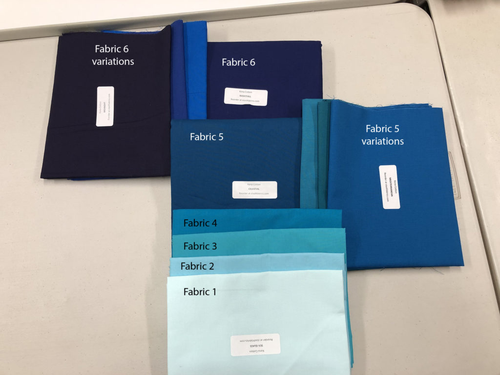
I then made the Kinship blocks from the Fabric 5 and Fabric 6 variations. Once done, I substituted them for the letter sections in Colorblock LOVE (and all of this is in the Addendum!)
If you’ve been making the Kinship Blocks already, you don’t have to make new ones to merge the two quilts. Just lay them out, and find the fabrics that bring them together!
OK then! Go choose some fabric!
love all the examples. where do i get the pattern?
it’s in the shop!
Great examples and information. I don’t think there is anything to improve on.
thank you!!
One of the most thorough tutorials I have read. Thank you!
thank you!!
I don’t know of it’s just me, but I’m reading this with my small kids in the room, and the info about which are colors 1,5,&6 isn’t sticking in my brain. It was helpful in the pictures when you labeled the fabrics with the numbers. I wonder if that would help otherwise. Thank you for this! I leaned a lot, and seeing different examples really helped.
Thank you for the feedback! I added more labels to the picture with Fabrics 5 and 6 pointed out – I hope this helps?!
Good advice on contrast, cool, warm and prints. You could use this advice for any pattern. I do like this quilt in all its different fabrics.
thank you!!
I agree completely with Elizabeth… but Victoria has a good point too (and I don’t have small kids around… just a large black dog!)… GREAT turorial Sam!! Super helpful particularly because I already know I want to make this with Navy and Mustard as my 5 and 6 colors!! (Mustard for the V.) Your second and third photo examples showed me I wasn’t crazy to use those two colors! The rest may end up being shades of grey, charcoal and maybe even white… or pearl grey. Making a mini is brilliant!!
Thanks ever so much! I will bookmark this post for future reference!
Mama_Pris
I added some more labels to the image that had the fabrics labeled – I hope that helps! Also – YES on the mustard and Navy! Can’t wait to see it!
Maybe I’ll make my Navy & Mustard version when you do the Sew Along! That would be super fun!! And if I finish in time… a really great Christmas gift for the kids!!
Fantastic tutorial, very clearly explained, Value is so important in quilt designs and fabric choice, I have learnt this the hard way! Thank you for a great tutorial, and I look forward to many more 🙂
thank you!!
Directions are clear. I like the many examples. I think best tip was to make the mini version. Great addition to your pattern. Fabric choices can make or brake such a visual pattern. Good job!
thank you!!
Personally, I think you nailed it…………thanks for the look into your brain’s ability to say it clearly and not have the rest of us going……..what!
Thank you for your kinds words Sherry!
Excellent tutorial, Sam. I have read through it twice and found it to be concise, abundantly informative and you explain the concept of value very well. As always, everything you do is thoughtful and precise. Thank you!
thank you!!